Color matching doesn’t seem like it would be very difficult but it can be. Reproducing a color has many variables involved. When you are having something printed with your brand color, you expect it to match – our color matching expert hand mixes every ink to perfect the color and ensure your product is EXACTLY how you want it.
Delta E (ΔE, or dE) is a metric for understanding how the human eye perceives color difference, the first goal is to make all colors meet a < 2.0 Delta E reading on the spectrophotometer. The ink commonly used to make the formula and production ink comes with a 2.0 Delta E standard. This means one can of blue might be 1.5 yellow and the next can might be 1.5 blue. To make both cans match, more yellow would be required on the 2nd can than it would on the first.
The next consideration is the application of the ink to different materials; each material has a different color variation to it so you have to make sure the correct materials is used. There are also different gloss levels, since the spectrophotometer reads in a reflectance mode this can effect the read outs. Additionally, some graphics are printed with multiple layers of colors to create opacity, each color below can change the appearance of the color desired.
Interesting factors that must be considered to perfect the color:
Emulsion thickness: the thicker the emulsion the darker the color will be, this can effect the yellow to blue hue on the color plot.
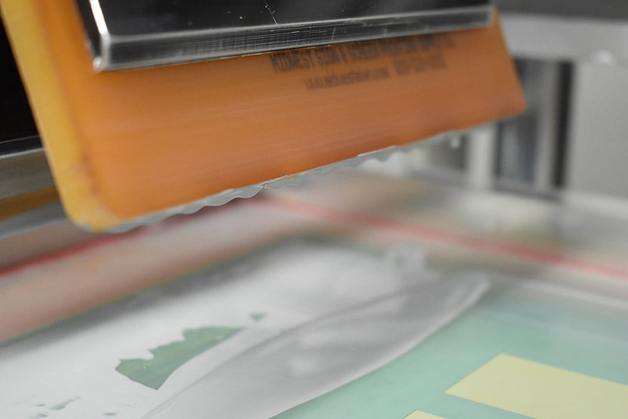
Printing press factors:
The squeegee: it has been found that the sharper the squeegee, the less yellow the color is, even the angle of the squeegee can be a factor
Off contact: the distance between the screen and the substrate
Peel off: lifting the front edge of the screen as the image is being printed. This helps with the release and gives the image a crisp edge
Release: how the screen breaks from the substrate as the squeegee goes over the image
How much flood there is (aka how much paint on the screen)
The Pantone Matching System (PMS) is a way to specifically define a color. However, as stated earlier, the Spectrophotometer measures a reflective reading, while the PMS code is typically printed on a coated piece of white paper, which varies greatly from a translucent material. This just adds one more element of testing to perfect the color.
Solvent Ink systems have another characteristic that need to be controlled, depending on what is being printed, the viscosity may need to be adjusted, this is done using solvent. If you mix a thinner viscosity or retarder (meaning more solvent is added), as the job is being printed the ink is evaporating the solvent off causing the ink to have a higher viscosity. When the viscosity gets higher, the color usually get darker because the pigment particles are now closer together increasing the density.
Color matching is an art!
Your brand is your life-blood, every single product needs to perfectly depict your brand, color especially. Don’t settle for anything less than perfect!
Let our color expert help give you the product you expect!
Check out this color matching video!