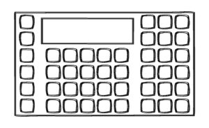
We posed this question (How many buttons are too many buttons [on a membrane switch]?) to our engineering team and they couldn’t give me an answer, which makes sense…every membrane switch application will have a different size, layout, and use requirements; a definitive number is just not possible. However, there is such a thing as too many buttons…to determine how many switches/buttons can fit in a given area answer these questions:
- What are the tactile requirements? Will there be domes? What size dome is required?
- What are the ESD requirements? How far away from edge of switch do keys need to be?
- What sort of environment will this be used in? Do you have sealing requirements?
- Will embossing be needed?
- Are LEDs required? How many?
- What type of circuit is it (common bus or matrix)?
A common bus (ground) connects one side of all the switches. 9 switches would require 1 trace for the common and 9 individual traces for each key, requiring a total of 10 traces. The advantage with this type of switch is that it is usually easier to layout, however, the disadvantage is the number of circuit traces required, this takes up more space, the more traces, the fewer number of keys that can fit in a given area.
A matrix configuration has the keys setup on an X-Y matrix (grid if you will). A 3×3 matrix gives a maximum number of 9 switches but will only use 6 circuit traces. The advantage with a matrix switch is there are less traces required and therefore more keys can fit in a given area, while the disadvantage is the difficulty of layout.
The answers to these questions will help, but ultimately, when designing a membrane switch interface, keep the end user in mind – how will they be using the machine?

Buttons should be clear and concise and tell the user exactly what it does.
What are my options if I layout the design and there are too many buttons?
First of all, kudos for recognizing that! Sometimes it is hard to notice when you know each button has a purpose. Second, determine if all of the buttons are absolutely critical to the functioning/capabilities of the machine. If the answer is yes, the most common solution to reducing the number of buttons is to create a menu – this could completely change the layout of the interface, especially if you didn’t intend on having a display screen. Keep in mind though, with a menu option, you have the flexibility to eliminate buttons and free up space to incorporate a screen to create a great user experience!
Another option is to involve your interface supplier in the design process – the earlier a design engineer can be involved, the more experience they can drop into your design to develop a user friendly switch that incorporates all needs and requirements!
