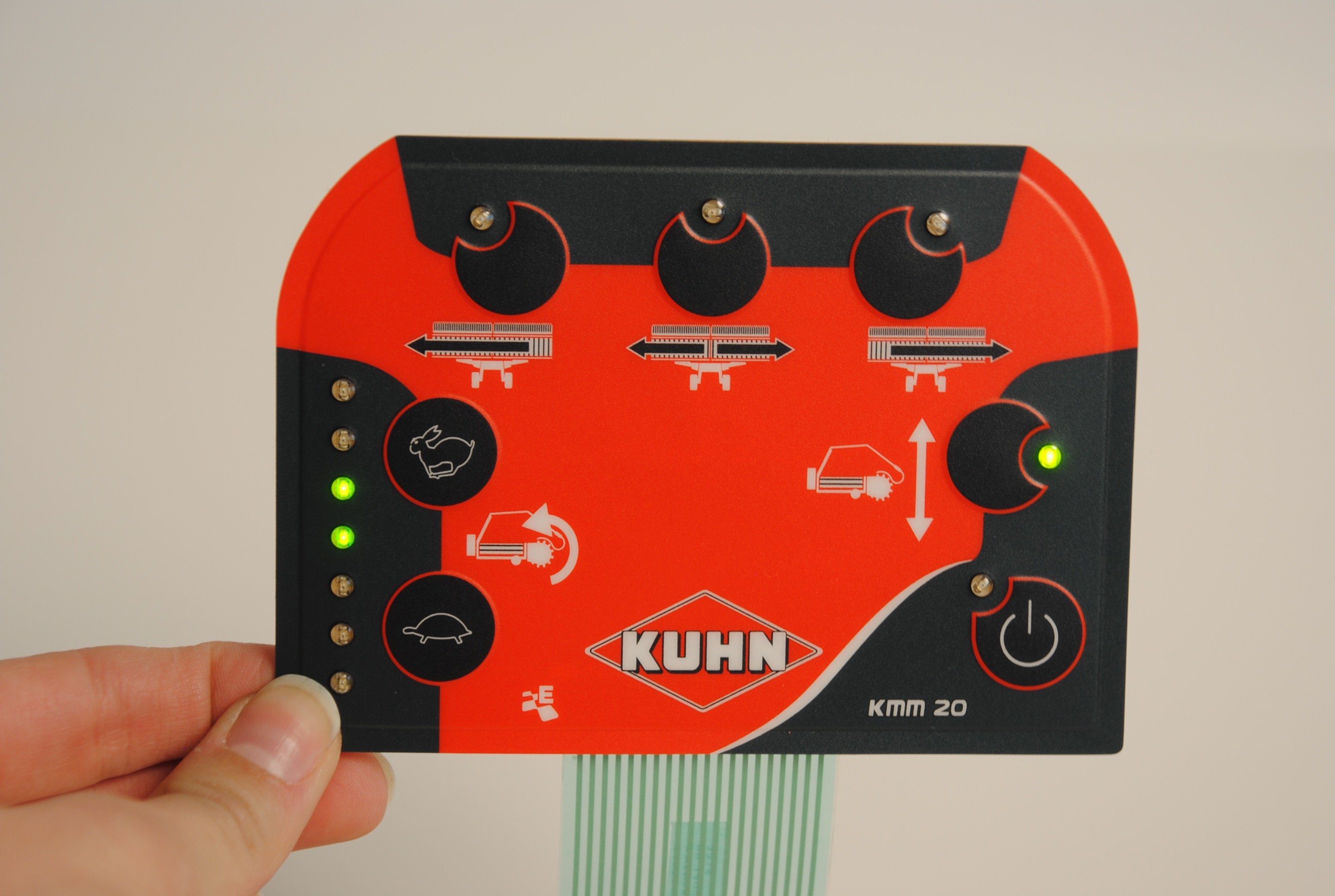
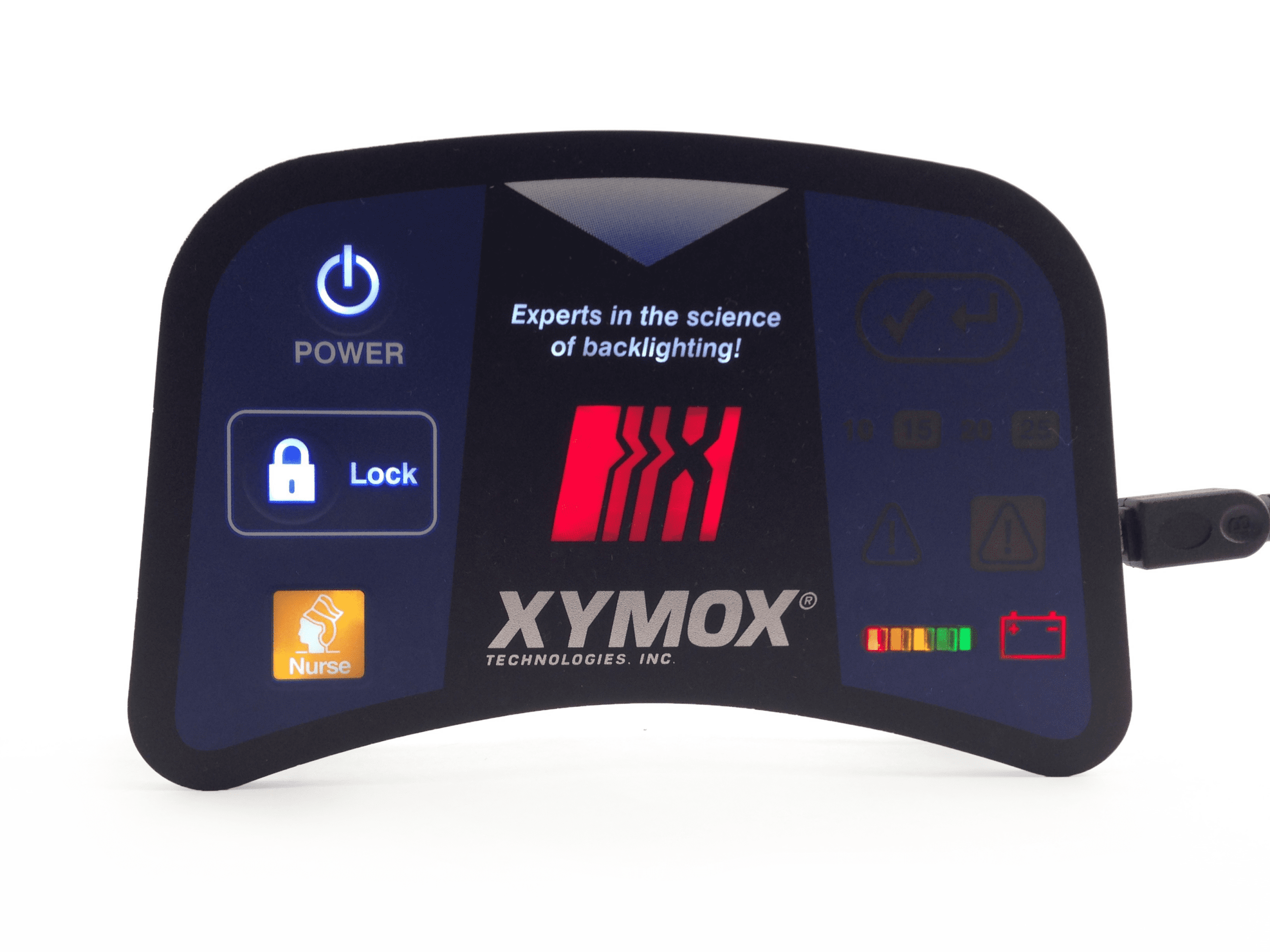
When backlighting is well designed and manufactured, it can create an outstanding user experience! However, it is important to note, common sense goes a long way when designing a membrane switch and the colors used for indicator lights – you want it to be intuitive! Can any Joe Schmo walk off the street and at first glance understand what the lights are indicating?
Standard colors and uses:
![]() = stop or warning, something needing immediate attention (red means stop!)
= stop or warning, something needing immediate attention (red means stop!)
![]() = machine is on/ready, current machine status is active, or safe to proceed (green means go!)
= machine is on/ready, current machine status is active, or safe to proceed (green means go!)
![]() or
or ![]() = caution or yield, changes or impending change of machine status
= caution or yield, changes or impending change of machine status
![]() = machine is starting up, or machine is status quo
= machine is starting up, or machine is status quo
![]() = connecting/pairing
= connecting/pairing
{{cta(’22dcd0a6-221e-488a-a434-797d0644642d’)}}

Bi-color LEDs are also available; these can be both red and green in the same package. This would allow a go (green) or no-go (red) indication in the same window while requiring only one window, with 3 possible states of the LED (green, red or off).
A row of LEDs can be created to show a “meter” or “charging” function. With green LEDs on one end of the row and red on the other end with yellow LEDs in the middle, this would show a “state of charge”. If the green LEDs are on you have a good power level and if the yellow LEDs are on the power is low and if the red LEDs are on you are almost out of juice.

Red and green and the most popular/commonly used LEDs, they are easily visible, easily understandable, an added bonus: red and green LEDs seem to be more reasonable cost wise. Yellow and orange have been the least popular as these seem to be the most difficult to see. Blue is slowly starting to become used more often. Any color can be achieved when using white LEDs and a printed color filter in the window.
